Totem of Taste
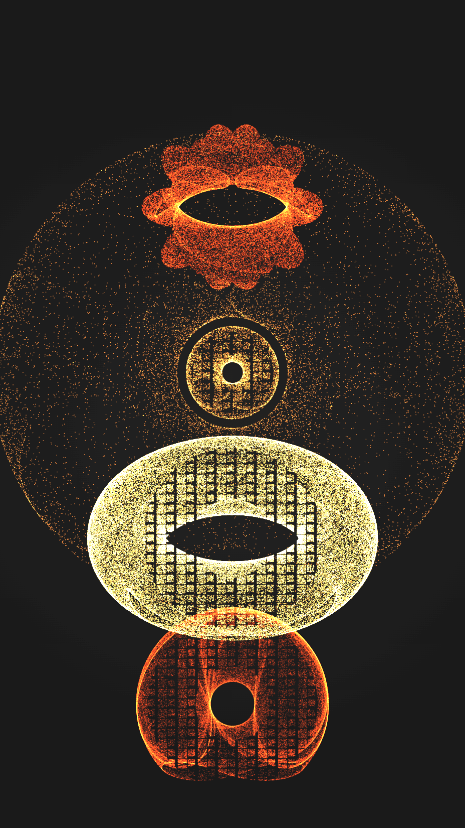
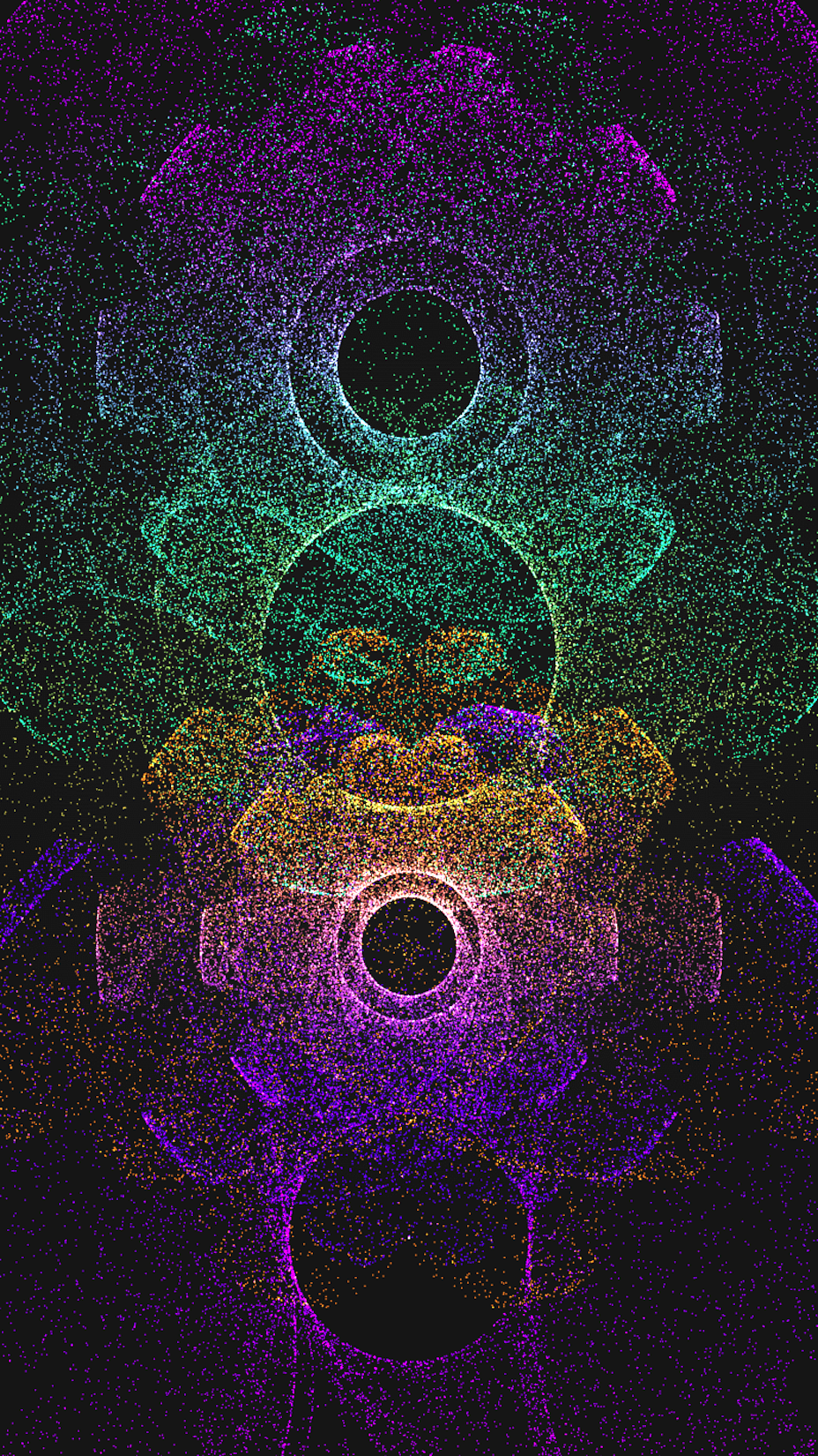
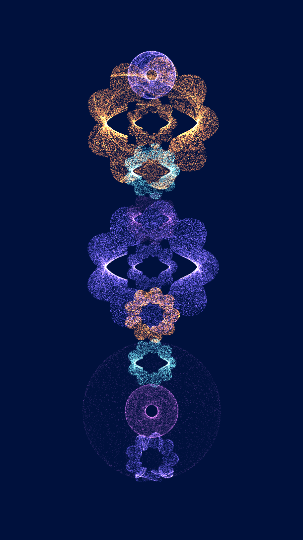
Totem of Taste is an abstract generative art project. In case you haven't seen it before, it's about food, taste and donuts, in 128 1x1 editions.
The origin story
I am drawn to large-scale sculptures of food and utensils. Examples include this spoon in Minneapolis, this fork by Lake Geneva, or the big ceramic apples outside of De Young in San Francisco.
The fascination with food is an experience simple yet universal. The memory of taste is depicted in literatures as a Proust’s madeleine moment. Yet genart pieces focused on tastes rare.
One day back in Jan 2022, I was playing with complex systems, and the donut shapes emerged. They carried a coarse-grained stone-like texture, as if can be made into a monument. Triggered by the various stacked objects scuptures I saw, the project was conceived.
I recall the sheer delight of the first sight, and adored the glow.
It was natural for me to make art about things I like – and I liked donuts.
They were iconic and totemic in their own right.
The Code Recipe
The donut shape was generated from strange attractors, which are systems of equations that evolve over time. The algorithm guided millions of points until they settle into deterministic shapes after just a few seconds. While I have been experimenting with generative art since 2018, my encounter with the many possibilities of attractors was two years ago via PyViz.
There was no artificial textures engineering. The points went on their walks, and maths did the work. These natural trajectories were evident in some donuts.
To create compositional variations, I further contoured the borders into mochi, old-fashioned donuts and their combinations, including the original one. Then a sprinkle of weighted randomness was added, such that some traits (colors, shapes) would appear more often than others.
To achieve unity among diversity, and partly to curate the output, I leveraged feature dependency. Some features depending on others, like the layouts (there are six of them – some stacked, some bursting) depending on the number of donuts.
The initial version of the code was created in less than an hour. What came next was tweaking, polishing, disassembling, reassembling. Little did I expect this labor of love to span nine months based on the time that I can garner.
Behind the scene
On some days I focused on the color palettes. I started by curating and generating 300+ palettes, then narrowed them down to around 30. A source of creative inspiration for the palettes is the works at the Metropolitan Museum of Art, as captured in the MetBrewer package by Blake R. Mills.
In selecting the colors, I considered both the interaction among colors, and the interaction between colors, luminance and shapes.
A small handful of them were named after food. Even fewer were named after places.
To make the colors compound, two forms of gradients are at force to mix them.
Yet the project didn't aim to be a visual feast of colors. The feast came from your memory.
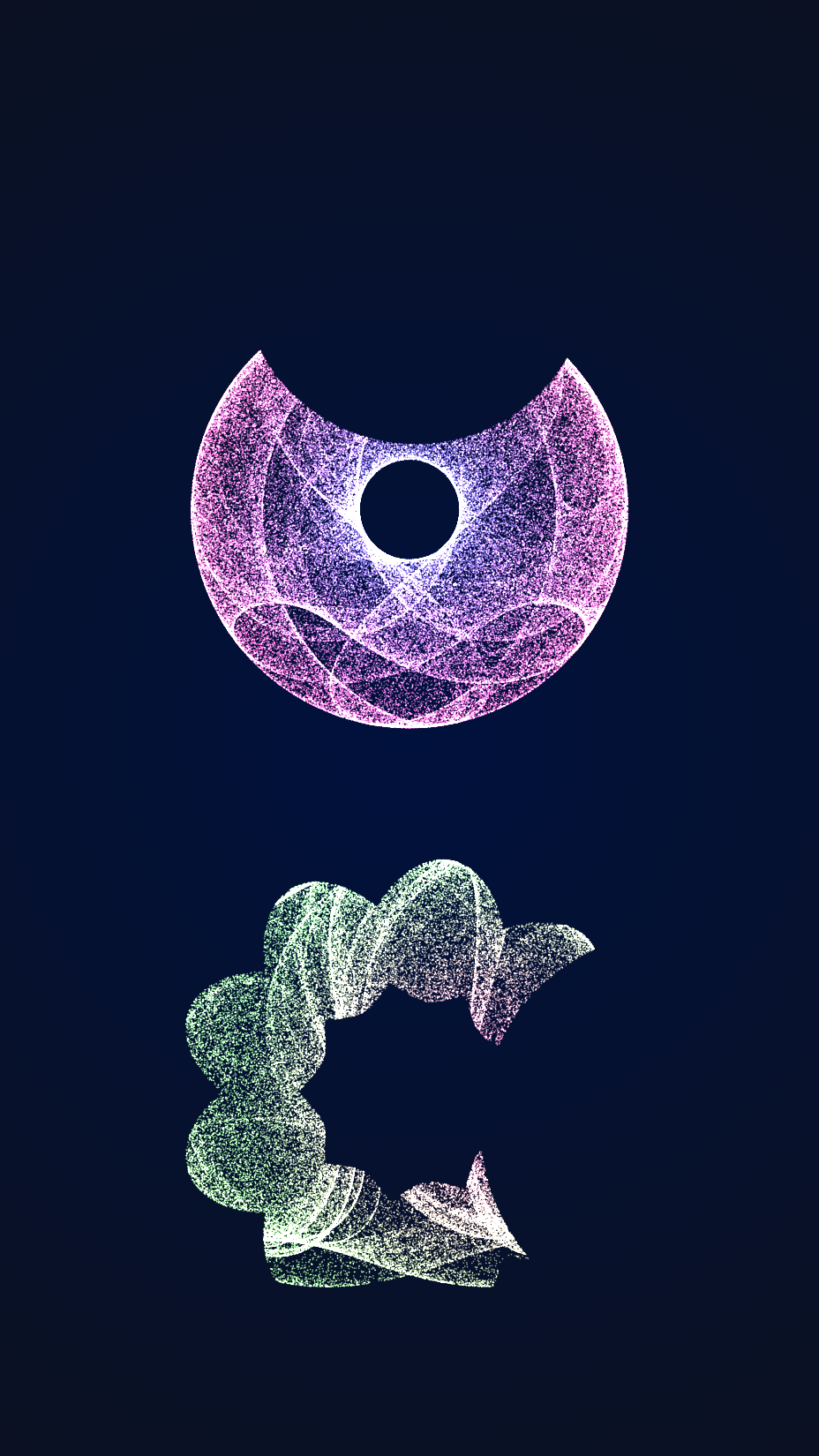
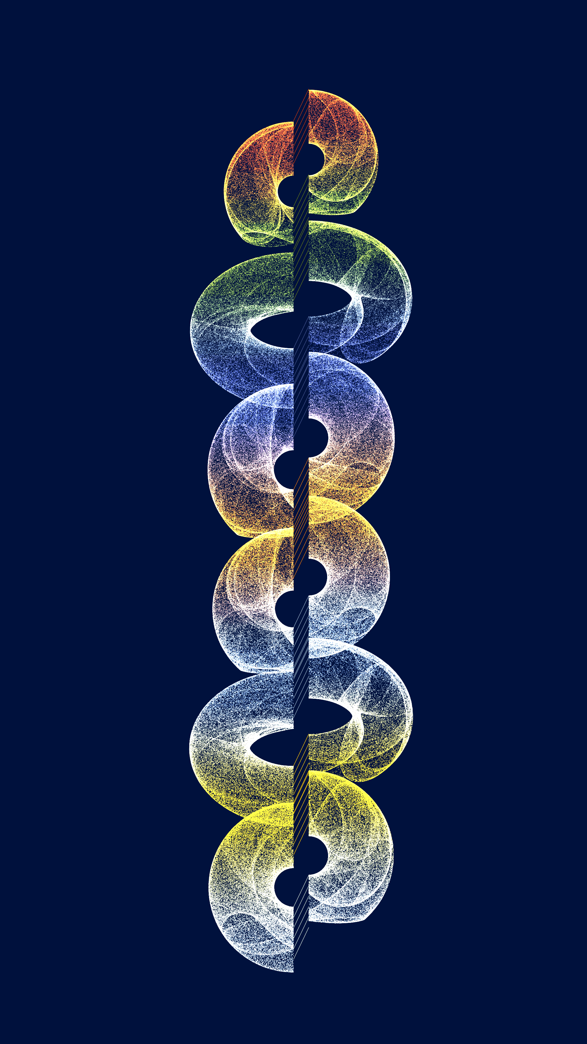
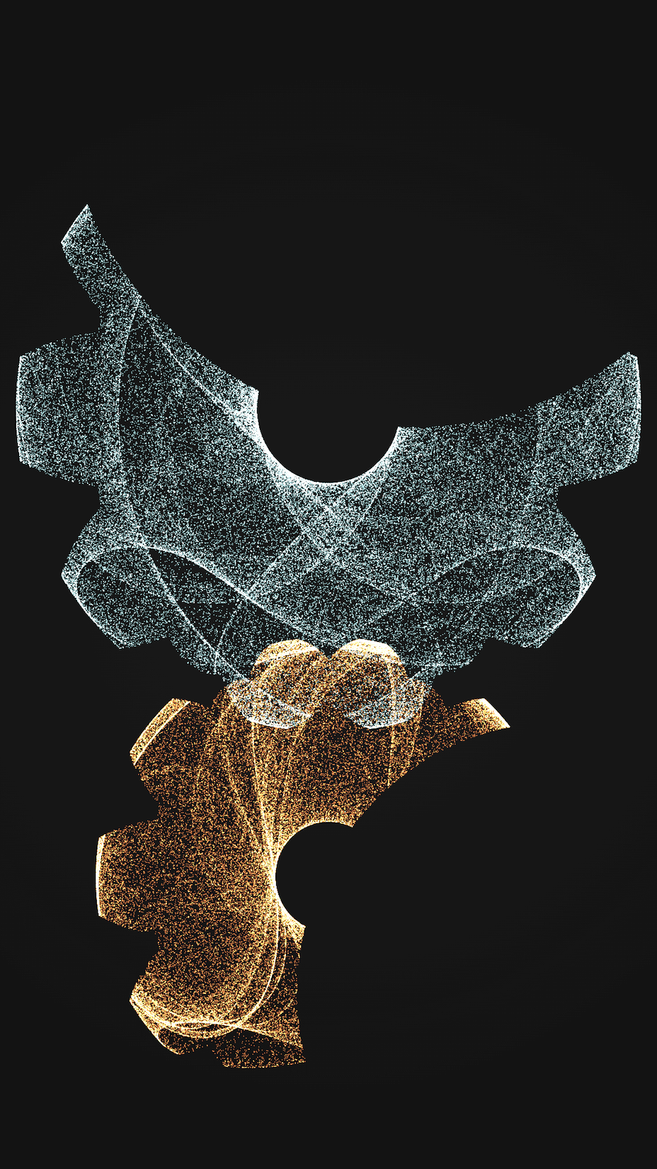
On other days, I experimented with the layouts.
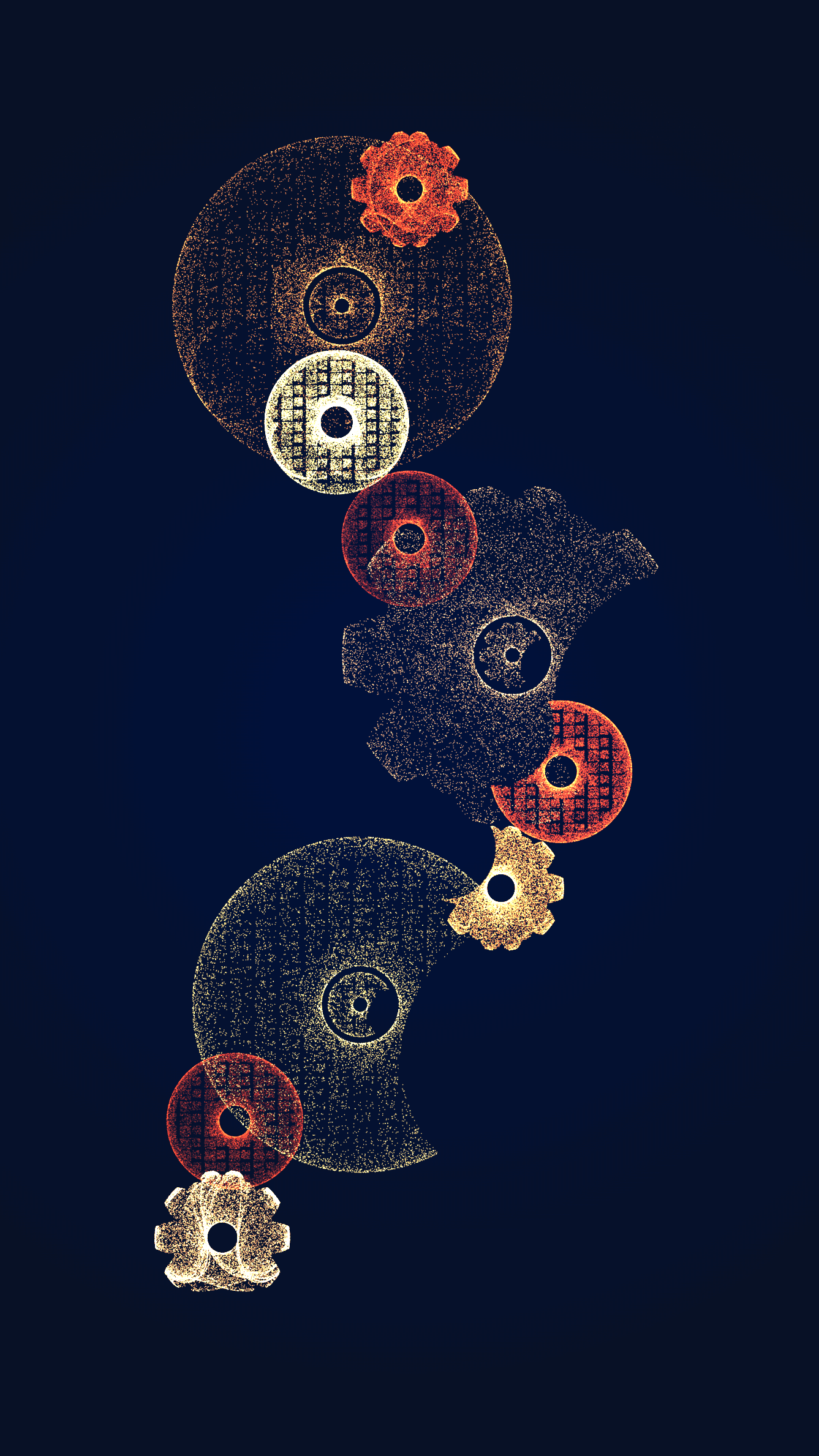
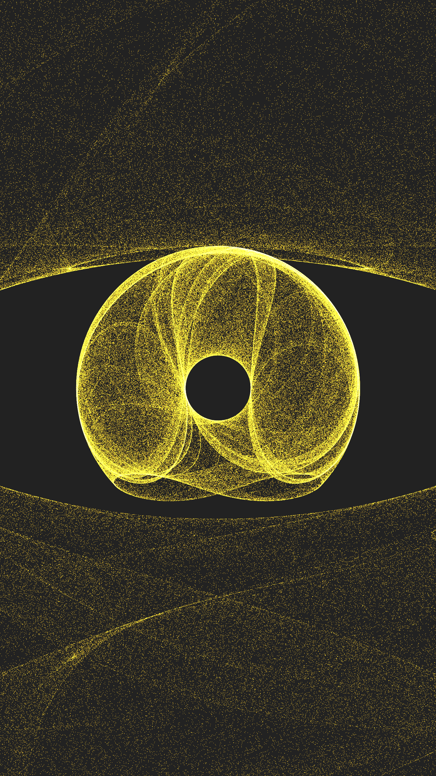
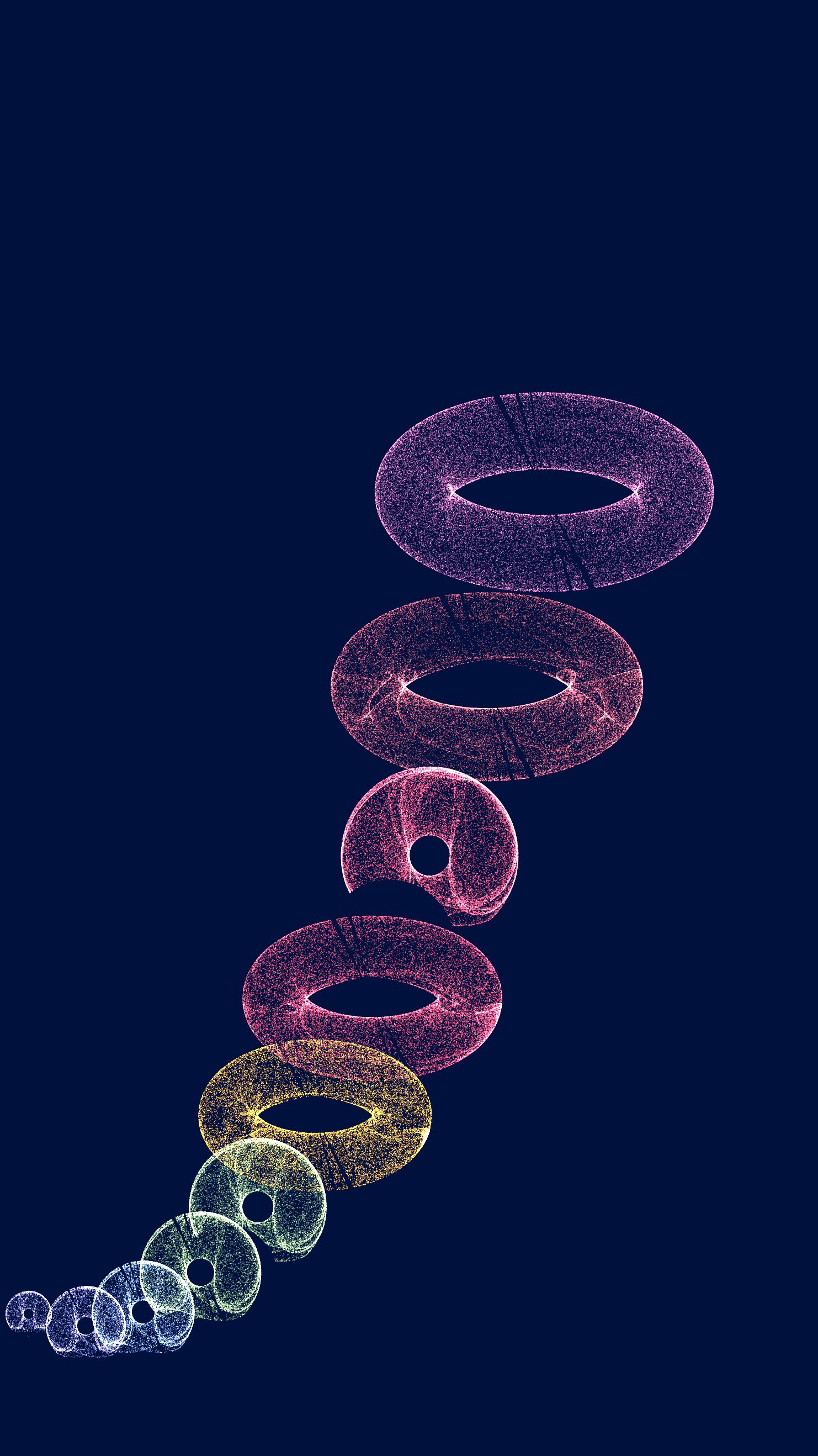
As a final touch, I attended to tiny details such as checking that the points would scale with the screen size. One thing to note is that the work renders live to fit a screen. So after the render completion those who attempt to zoom using double-tap on the trackpad or + button are gonna be disappointed, because they will face a stretched-out version not in their best shape. The best way to zoom and preserve its visual quality is to render it at a larger monitor, which is integral in capturing all the intricate details.
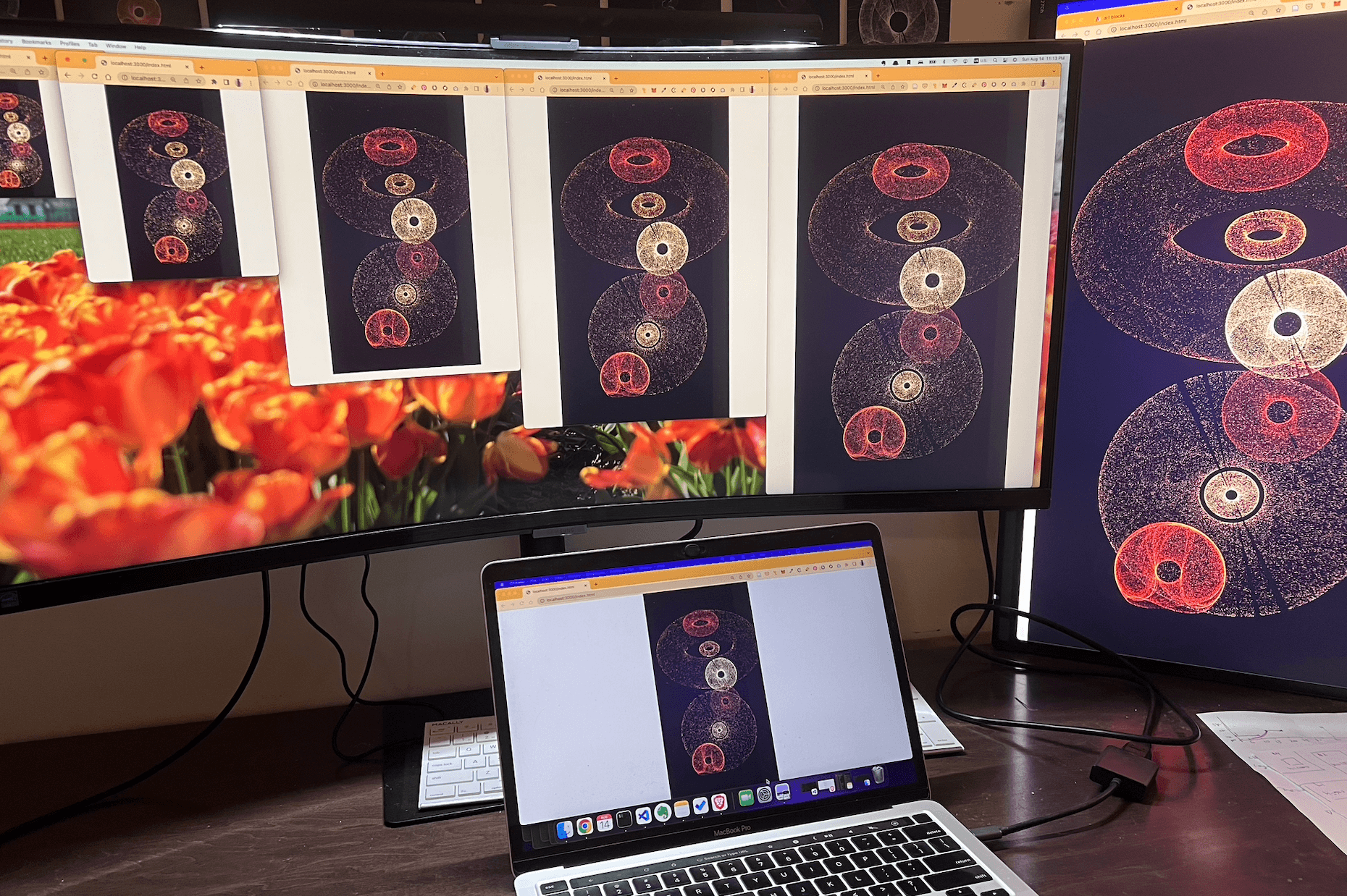
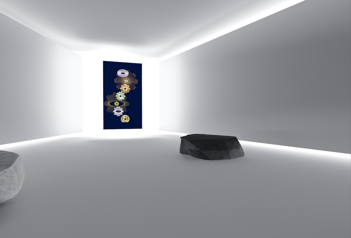
To display it, I recommend digital display, such as a vertical monitor or art frame as it best brings out the lustre.
For collectors who prefer prints, I found the pronounced textures of Hahnemühle G-etching paper go well with its dark background. If you need a digital copy of your token in a specific dimension or have questions regarding the project, I can be reached via twitter or discord pm and more than happy to generate one for you.
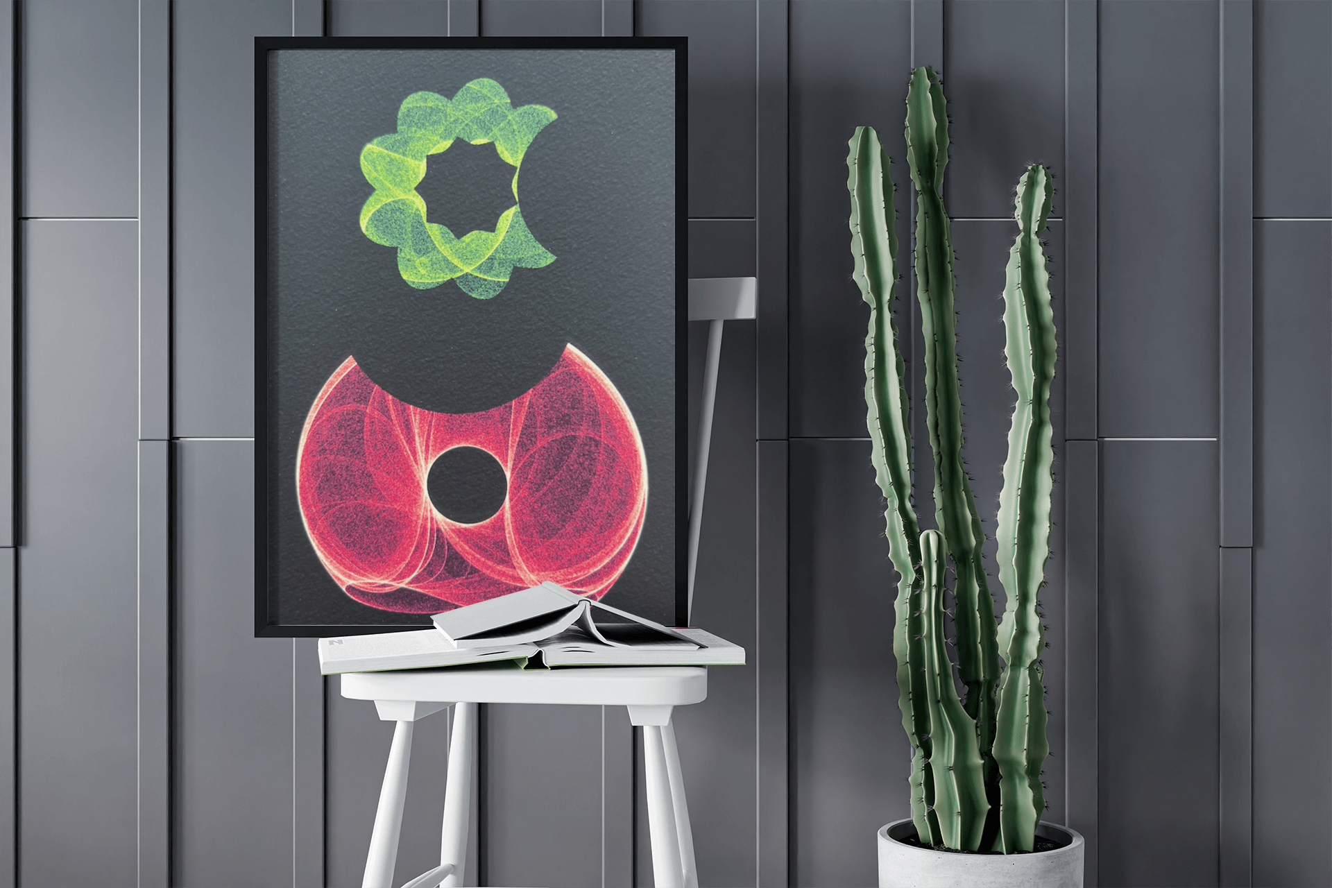
Please enjoy the additional outputs below, or check out the project here.
